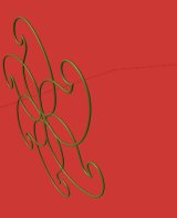
 Having decided previously to maintain the same visual identity as the old site, I decided to start off work on the new splash page. Technically, the splash page is a very minor part of any site, but in practical terms it is a very important step in the web design process. Firstly, it decides what kind of first impression you make with your viewers. And secondly, from the designer’s point of view, it sets the tone for what remains to be designed – i.e. the entire site. I liked the traditional circular motif on the splash page of the old site, and decided to try to keep that in the new one. On the old site it was a 2D graphic, but this time I decided to use my new-found Blender knowledge to add some dynamic looking 3D into the mix. So, my splash page struggles began with modelling the motif as a 3D object and then matching the colours to the original. I was quite successful in that regard.
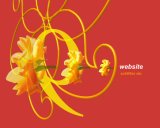
 As I have stated in earlier posts, I want this site to be a little like my old site but much more. Since I was bringing in graphical elements from the old splash page, the new one needed to have ‘more’. My 3D skills were slightly evident in the Blender object of the motif, so what remained to be represented was photography and typography. Others like illustration etc. could be added in, but that would make this almost the noisiest splash page in history, and besides, that is what the site is there for. I really don’t need to show everything in one page – just enough to reel them in. For typography I added in one element to carry on the same rhythm as the motif, and for photography I chose an appropriately coloured flower from a photograph I recently took.
 The elements were in place and now it was simply a matter of going through that long process of educated trial and error and inspiration we like to call design. The typographic element fit in quite well to begin with, and the slant of the entire composition provided a natural position for the website tile. The photographic flower, however, proved to be more challenging. Many, many permutations and combinations later, I finally arrived at this.
At the moment, I feel it meets my requirements admirably. It keeps to the visual style of the old site while adding some much needed dynamism and variety into the mix. Now, at least work can continue on other aspects of the site. It remains to be seen if my satisfaction stands the test of time.
Liked this article? Please share it: ![]()
![]()
![]()
![]()
![]()
![]()

Thought i’d break the jinx of you not having any comments on your blog!!! 🙂
Oh! It’s only you.
I was really scared there for a moment.
😛