Logo design often involves a very fine balance between being visually arresting and blending into all the material that inevitably surrounds it. This balance becomes even trickier when the logo is for a person and not an organisation. If the individual is in a very visual line of work, the choices are less complicated but when seemingly stoic industrial realms are involved, clown colours, googly eyes and other such blatant attention grabbers are out and the logo needs to walk a tight-rope between modesty and visual boldness. This was very much the case when I set out to design a mark for my Father, who works in world of water-treatment and industrial chemicals as a consultant.
The task of branding the senior Mr. Bharadwaj’s new sojourn into independent consulting didn’t begin here, but rather with a business card design done in a hurry. Then too Vishal faced the issue of balancing staid industrial branding tropes with a more liberal application of visual design, and the more expressive won out as the direction of choice. We didn’t make a logo at the time but a certain minimalist and bold visual identity, with stylised references to chemistry molecular diagrams was committed to. That business card has continued to be used effectively and soon it was time to work on a simple single-page web presence.

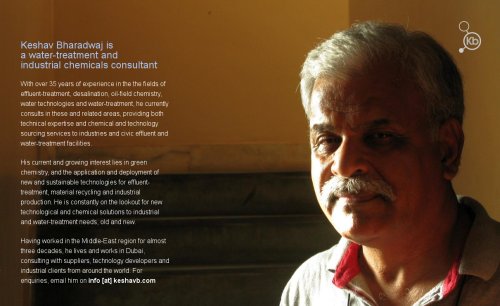
In its present state, the website KeshavB.com was meant to be no more than a professional looking online presence with the most basic information of what expertise were available and how people could get in touch with queries. It was also meant to be personal, because the difference and strength of an independent consultant in a highly commercial market is the fact that they are expert individuals and not employed by a specific commercial concern to push their interests. A solution for a personal single-page website was found in The Personal Page, an open source working template to create a mobile-friendly responsive site with some descriptive text, a background image of the person represented by the site, and a small logo or monogram in the corner. It’s quite a clever little solution if you’re comfortable with HTML and CSS code. I had a fitting portrait photograph taken with my Canon G9, which only left the matter of the logo.

The final logo was designed almost as quickly as the business card several months ago, but this time I had an existing identity to build on and so the logo continue the motif of molecular diagrams. Three circles in an angled molecule was chosen to vaguely hint at the structure of water (H
The end result worked well as a personal monogram, a branding mark, and also fit quite handsomely into the web page layout of the one-page site. It adds a certain professional character to the page which will serve well any further stationery designs we do. For now, KeshavB.com is a wonderfully simple and responsive place for the logo to be seen and for it to strike that right visual balance between serious business and personal statement.
Samir
Liked this article? Please share it: ![]()
![]()
![]()
![]()
![]()
![]()


Thanks for a great page and logo what are sons for if not take advantage of
I see a logo with strengh bases on simple but intelligent traits, so I´m sure it will work as it was intended, congrats to you and to your father for having such good designers as sons 🙂